
Blog
Warm up your interiors with this season’s runway shades

From bold colors and comfortable fabrics to creative and innovative ideas, this year has seen a remarkable diversity of trends in the world of design, catering to the tastes of fashionistas. Colors, in particular, have major influences in interior decoration and furniture.
According to Pantone, the global color authority that influences trends in the design world, the fall/winter 2024-2025 fashion color report from the New York, London, and Paris fashion shows, the colors are saturated and closely related to nature, with warm tones derived from natural pigments and luxurious midtones. To further expand on Pantone’s trending color palette, which will not only be present in clothing, but also in various areas, including décor
جدول المحتويات
7 Pantone colors this season

1. From the Fall 2024 Gucci show
2. From the Elie Saab Fall 2024 Elie Saab show – Photo courtesy of Launchmetrics/Spotlight ©
3. Living room decor featuring a sofa from the AtoB collection by Busnelli
4. Le Miniature Lc2 bench by Cassina
5. Libro bench, designed by Gianni Pareschi from 1970, for Busnelli
Halima says about colors in general: “We know that their choice is key to creating a certain atmosphere within a space.” She adds, “Colors not only reflect visual aesthetics, but also affect the feelings of the occupants. “Colors not only reflect visual aesthetics, but also influence the feelings of the occupants.”
Here are seven of Pantone’s Fall/Winter 2024-2025 color palettes that exude self-confidence and simplicity, with Maskim’s comments and tips on how to use them at home.
Starlight Blue is a soft blue hue
Pantone’s Starlight Blue reflects a sense of serenity and tranquility, reminiscent of a clear sky and pure water, making it ideal for spaces that need serenity and balance.
In contemporary homes, this shade of blue is used in bedrooms to create a cozy atmosphere, and in bathrooms as a main color for wall paint or floor tiles.
Starlight Blue can also be integrated into the living room through pillows or curtains. In the kitchen, the same color gradient can be found on the upper cabinets or walls. Starlight Blue is balanced and easy to combine with other colors such as white or light gray.

1. Bon Bon wall light by Draga and Aurel, available at Nilufar Gallery
2. Pietra Mare pebble rug in the color of the sea, by Amini Carpets
3. Roche Bobois Resonance Cushion, Roche Bobois
4. From Moschino’s Fall 2024 Moschino show – Photo courtesy of LaunchmetricsSpotlight ©
5. Mondini Sofa by Baxter
6. Azul Button Chair by Turri
7. Kopppel Jug by Georg Jensen
8. Diplomatico Bench by Ego Italiano
9. Atelier coffee tables by Turri Turri
Wave Ride Medium Blue
Pantone’s Wave Ride medium blue is energetic. The color gradient adds energy to interior spaces and can be combined with neutral colors such as white or black. In the kitchen, the tiles on the backsplash carry the shade of Wave Ride, as do the shelves, and in the living rooms, the midnight blue gradient colors one of the walls to make it stand out.
In the dining room, it creates a sense of vibrancy, while in the bathroom, Wave Ride represents boldness when it sits behind the bathtub.

10. From the Fendi Fall 2024 show – Photo courtesy of Launchmetrics/Spotlight ©
11. Totu lounge chair by Toan Nguyen for Fendi Casa
12. Passe-Partout Pouf by Turri
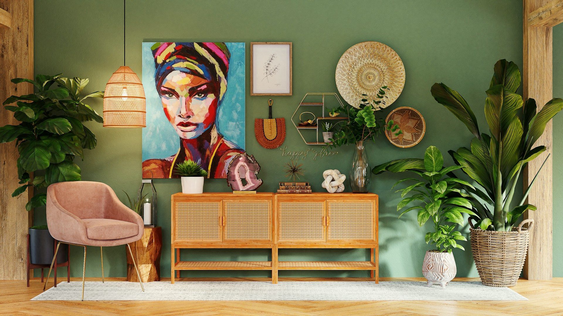
Dark Green Iguana
Pantone’s Iguana is a dark green, reflecting nature and bringing a warm vibe to any interior space. This shade of green is suitable for use as a accent color in a living roomor bedroom wall. It adds warmth and natural balance to interior spaces, and is also used in the bathroom on a wall behind the mirror. In the kitchen, it sits on the bottom drawers, or as a backdrop for wall tiles. Iguana can be combined with beige or natural wood.

1. Two Fendi Casa chairs, available at Palazzo Collezioni
2. Roche Bobois living room decor from Roche Bobois
3. Yumi cushion from the Les Contemporains collection by Roche Bobois
4. Hand-painted tray by Les Ottomans, available at Farfetch.com
5. Grumetto sofa by Elena Salmistraro for Busnelli
6. From the Fall 2024 Hermès show – image courtesy of Launchmetrics/Spotlight ©
7. Blown glass vase by Ligne Roset – Photo courtesy of Launchmetrics/Spotlight ©
8. Armadillo chair, by Gianni Pareschi, 1969, at Busnelli
9. From the Fall 2024 Hermès show
10. Carmo chair from Bo Concept
Storm Front Dark Gray
Pantone’s Storm Front dark gray evokes strength and elegance, while adding a touch of sophistication to modern interiors. The dark gray is easily combined with dark blue or warm yellow for an attractive visual balance. This color shade is perfect for living rooms and home offices, and is striking when it appears through furniture, such as a sofa or a set of side tables. In the bathroom, dark gray is noticeable on the floors or walls of the shower cubicle, and also on the countertops or lower cabinets in the kitchen.
Misted Yellow Warm Yellow
Warm yellow, called Misted Yellow by Pantone, adds a touch of optimism and brightness to any interior space, combined with neutral colors such as gray or white. This shade of yellow stands out beautifully without being loud or distracting. It can be used to paint a wall in the dining room for accent purposes, or as a backdrop for open kitchen shelves. This color scheme is also suitable for children’s rooms, as it promotes a sense of fun and positivity.

1. Busnelli’s Piumotto living room
2. Ventaglio coffee table by Ego Italiano
3. Another living room from the Piumotto collection by Busnelli
Pinecone Dark Brown
Dark brown, called Pinecone by Pantone, is associated with qualities of stability and warmth. The yellow hue is ideal for master bedrooms and living rooms, and is brought in through side tables or beds. This color shade is acceptable in large spaces that are hungry for natural and elegant accents. In the bathroom, it is used in the edges of furniture or as a mirror frame, adding a classic touch. In the kitchen, it looks great by painting wooden cabinets or large tables.

4. Salamanca sofa from Bo Concept
5. From the Stella McCartney Fall 2024 Stella McCartney show – Photo courtesy of Launchmetrics/Spotlight ©
6. From the Fendi Fall 2024 Fendi show – Photo courtesy of Launchmetrics/Spotlight ©
7. Funny sofa from Ego Italiano
8. Poltrona Frau Leplí Pouf Seats by Poltrona Frau
9. Harlem sofa from Ego Italiano
Bold Red Cherry Tomato
Pantone’s Cherry Tomato is bold and vibrant, so it can be used to paint a wall in the living room, kitchen, or dining room. In the bathroom, it works as a backdrop color for the sink, as accents on shelves, or even through accessories. In the kitchen, it adds a contemporary touch through the chairs.

1. RGB Murano glass spacer decor by VéVé
2. Lamp by Zanellato and Bortotto for Louis Vuitton
3. Amburgo Bench by Paola Navone for Baxter
4. The Five Seasons home fragrance by Marcel Wanders, available at Sel Et Poivre
5. From Ralph Lauren’s Fall 2024 show – Photo courtesy of Launchmetrics/Spotlight ©
6. Jan Kath – The Book
7. Hermès Cordélie cushion from Hermès
8. From the Stella McCartney Fall 2024 Stella McCartney show – image from Launchmetrics/Spotlight ©
9. Piumotto living room from the Piumotto collection by Busnelli
10. Dalia Vase 2 in 1 by Ligne Roset
11. Totu Bench by Toan Nguyen, for Fendi Casa
12. Blow-Up Bench by Controvento, Fendi Casa
13. Eames House Bird by Charles and Ray Eames, available from Vitra
Mistakes to avoid
Architect Halima Maskim emphasizes the need to incorporate trendy colors in ways that balance aesthetics and functionality. In other words, for colors and their shades to express harmony, bright and neutral should be combined. For example, Wave Ride is paired with white to accentuate vibrancy without overdoing it, or Storm Front is used as a base color with touches of Misty Yellow to brighten and balance.
She lists mistakes to avoid when combining colors:
- Randomness: It means combining strong colors together without planning, resulting in visual complexity.
- Overuse of one color: Although shades like Cherry Tomato and Misty Yellow are associated with energy and radiance, too much of one color can strain your eyesight.
- Failure to consider the nature of the space: It is important to consider the size and function of the room when choosing shades of trending colors, as the opposite can lead to the illusion of a small and cramped space. For example, Storm Front makes small spaces look cramped and dark, so it’s better to use it in larger spaces.
- Lack of color harmony: Colors on furniture and décor should be coordinated and balanced to achieve aesthetic appeal.